This week I'm taking on Austria's biggest railway.
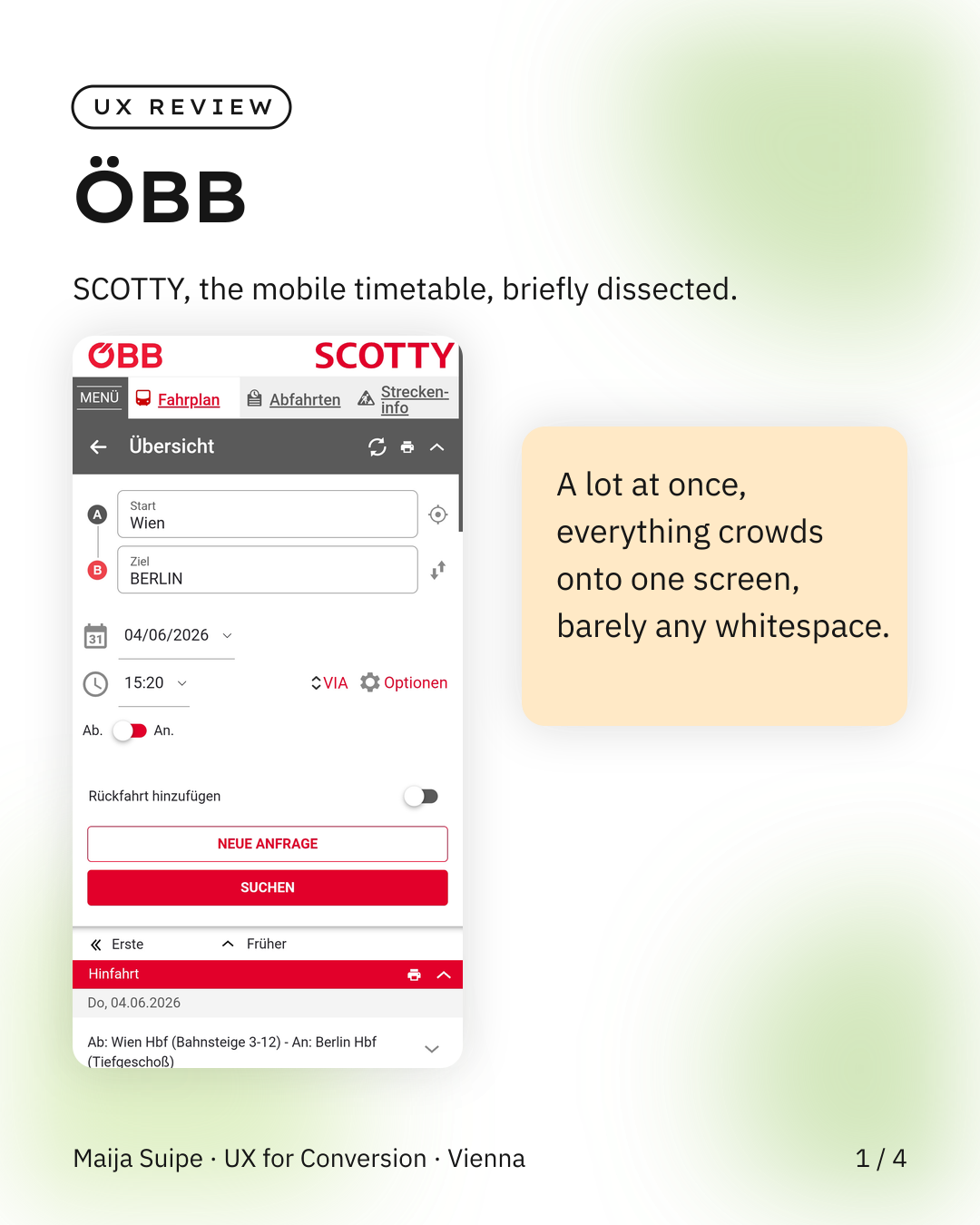
SCOTTY, ÖBB's mobile timetable, is quite a lot at once, because everything sits close together, there's barely any spacing and somehow it all crowds onto a single screen, and that fits badly with the fact that you rarely use a railway app in relaxed moments, but rather while boarding on a packed platform, so an overloaded interface in an already overloaded situation.
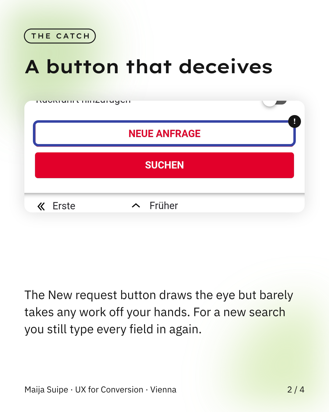
What stands out to me most is the New request button, placed centrally and prominently, but it barely takes any work off your hands, because for a new connection you still have to type every field in again from scratch, so basically a button that draws a lot of attention and in the end delivers little.
And yet the simplest lever would be completely free, namely more whitespace, because even a bit more space between the elements would make the whole thing noticeably calmer, and calm is exactly what you actually need on the platform.
No redesign needed, often all it takes is a few breathing spaces in the layout.