Claude builds you a landing page in two minutes. It looks really good, and would still have driven the bounce rate up.
I've been playing around with Claude as a design tool a lot lately, and honestly, for many things it's impressive. But one thing keeps catching my eye: instead of a real hero image at the very top, it almost reflexively drops in a big slogan, just text, large and centered, taking up half the first view.
The problem with that is something well documented in the UX world, namely banner blindness. Over the years our eyes have learned to simply skip large, ad-like blocks of text without really reading them. And that's exactly what happens, people scroll past the slogan without anything sticking about what it's even about.
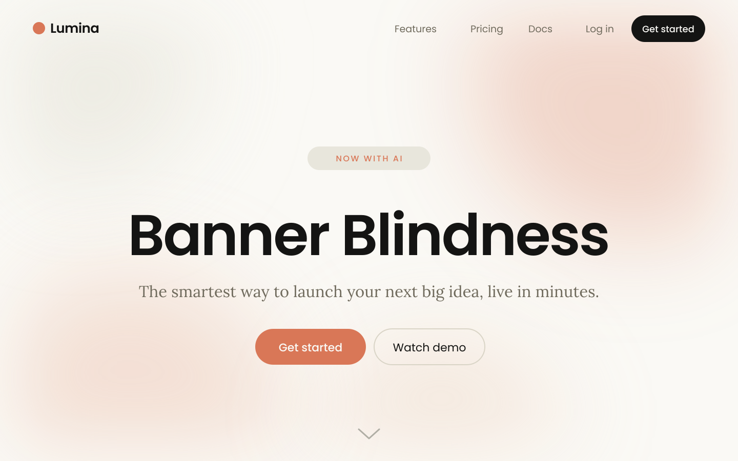
I know that finding a truly good hero image is more work than most people think, it's really no given. But just putting text there instead, text nobody stops to read anyway, makes the whole page completely forgettable in the end.
And that's not a small thing, because the hero area is one of the most important parts of the whole page. That's where it's decided in the first few seconds whether someone stays or leaves, and that's where you keep your bounce rate low, or you don't.
Don't get me wrong, AI is a great tool, and I enjoy using it myself. But it's certainly not infallible, and especially where conversion is concerned, it still pays to have a human who knows what matters.