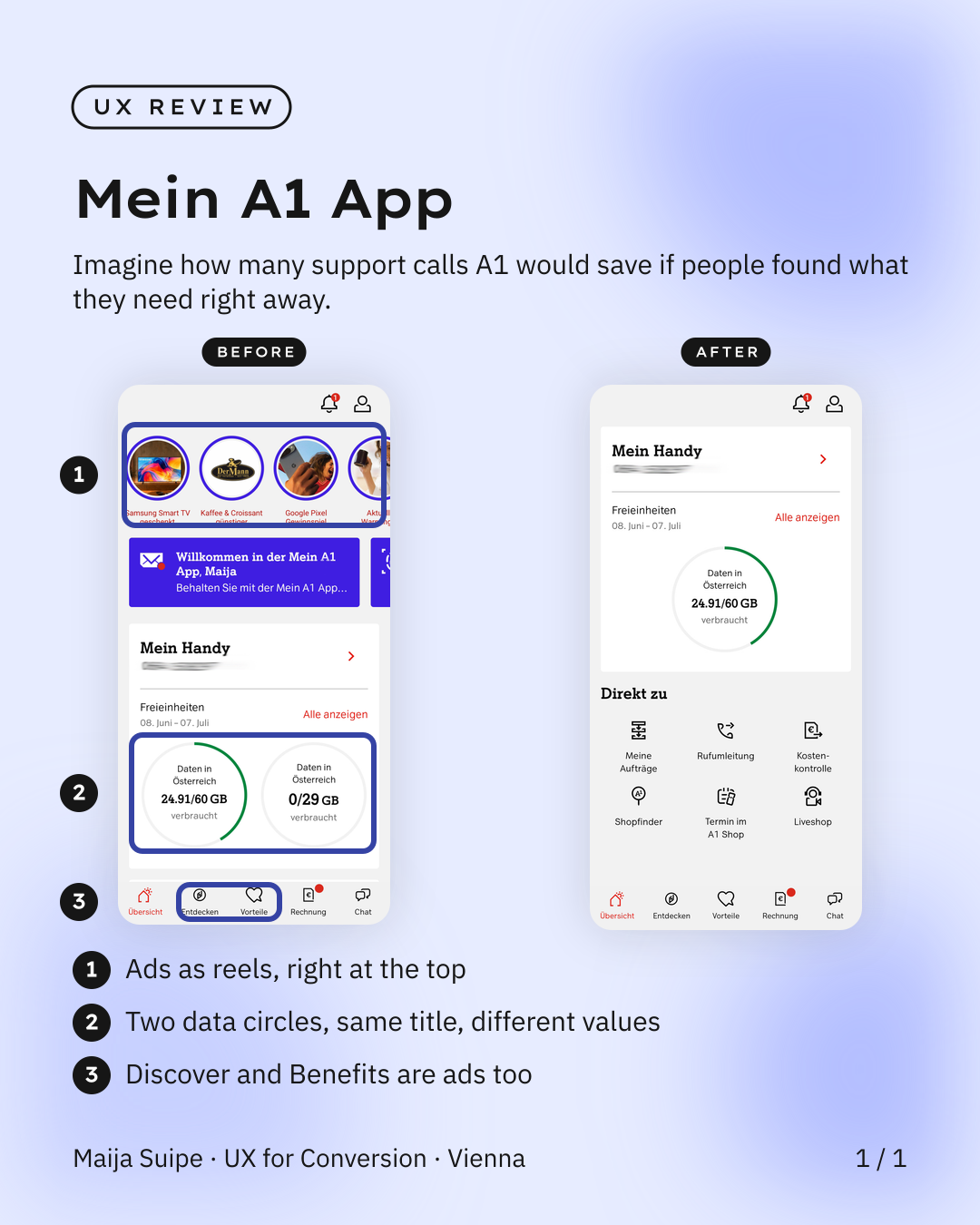
I've been with A1 for years, and still, the first thing the Mein A1 app shows me when I open it is a row of ads.
Right at the top there are ads running as reels, just below come Discover and Benefits, and it already feels a bit like I'm digging through my spam folder, even though I'm already a paying customer and really just want to quickly get something done.
The features most of us actually need, like My Orders or an appointment at the A1 shop, I only see once I scroll all the way down. And then there are two circles for data usage, both labelled exactly the same, namely Data in Austria, but showing two completely different values, so I genuinely have no idea what's what.
And that's exactly where the point that actually costs money lies: when people can't find what they're looking for right away or can't reliably read their usage, they ask. In the chat, on the hotline, in the shop. Every one of those questions is a contact that A1 could simply save itself with better UX.
The good news is, this doesn't need a big redesign. It would already be enough to pull the important features up top, push the ads further down, and give the two data circles clear, distinct labels. On the right you can see how I'd solve it, everything where you'd expect it.
As a long-time customer of Austria's biggest telecom provider, I'm hoping there's still room to move here.